Composite 2

For my second composite project I was originally going to run with a Kanye West idea but I decided to try something different instead. I chose to make an Audio Book CD for the book 12 Rules for Life: An Antidote to Chaos by Jordan B. Peterson.


The Client/Product:

Jordan B. Peterson is a Canadian born clinical psychologist and professor of psychology at U of T. Peterson gained popularity in 2016 when he released a series of videos on his YouTube channel in which he criticized political correctness and the Canadian Government’s Bill C-16 because of free speech implications.
I wouldn’t say it’s a self help book although the title does make it sound that way. It’s more than that. It’s basically a breakdown of his conscious thoughts on a bunch of aspects of life and how they can be interpreted, and what lessons we can and should be learning from the actions that take place within our lives. Suffice to say it’s a very interesting book and it leaves you with a lot to consider.
Target audience isn’t specific, just mature readers that can understand the content, which would probably be people over 20, male and female.


Design Strategy:

I wanted to create some kind of altered coloured portrait and run with that and use it for the cover. I chose not to recreate or alter the ‘logo’already used for the book, and instead traced it and re-used it. I borrowed the gold-ish colour for later use in the website as well.
I was able to find one of the fonts used on the actual cover of the book as well – Schoolbook Regular – and used that for some of the type on the cd cover and website.
The original background on the book is white, for whatever reason my brain screamed Marble so I found a giant marble image and used that with alterations for the background sections of the website and for the panels in the actual CD booklet/backing.
On the back panel of the booklet that would be facing the CD I included the 12 rules and within the booklet an excerpt from his introductory chapter that focuses on Chaos and Order.

Link to the booklet: CD Booklet Link


Website:

I opted to go with a one page scrolling site for simplicity. Site features a main section, about section, media section, tour section, and a contact section.

  • Main section features an image slider that (would) link to articles featuring or related to Peterson and his work.
  • About section features the main cover image + a short write up about Peterson.
  • Media section features one of his many lectures that have been uploaded to YouTube.
  • Tour section features a div that scrolls with all of his upcoming book tour dates.
  • Contact section featuring a short form that allows you to write in to the man himself.

Link to the mock-up since I don’t have it hosted live:  Mockup Link


Summary (What I learned / Would do differently):

I learned that I procrastinate too much. I learned that I need to work on my time management, and actually construct and stick to a working schedule when tackling projects like these. I learned that I can do/create things that I initially think I can’t.

If I were to revisit this project, I would have invested a lot more time than I did. I would have experimented with more ideas and done more research.

Ad Campaign Composite

This past week we were tasked with creating a 3 ad campaign that would be featured in a magazine.

For my project, I chose FromSoftware as my client. They’re a Japanese video game company now famously known for their Dark Souls series. They are releasing a remaster of the original game from 2011 on May 25 and that’s what I chose to advertise for.

My target audience for these ads are mature male gamers between the ages of 18-35. In order to reach this target audience I would feature my ads in Game Informer’s magazine. Their magazines average reader is 32 years of age, they provide both digital and paper versions of their issues, and they cover games on all platforms (this is particularly helpful as this game is being released on every current platform).

Since the game is a remaster and it isn’t a brand new title, my idea behind the ad design was to try and create an illustration of three of the more iconic characters and their armor from the game (the Elite Knight, Solaire of Astora, and Artorias the Abysswalker)  in hopes of triggering some nostalgia in veterans of the series, or at the very least gamers who are somewhat familiar with it. I wanted to add some sort of dispersion effect to make the illustration seem like it was being faded away and to make it a little more lively. This is an effect present in the game whenever the player dies, and is also relevant to the collection and loss of ‘souls’ (basically the players currency and experience) throughout the game. It also helped make the image look a bit more gritty and worn down which is fitting with the themes present in the game.

Initial design concept sketches:

My main images after applying their various effects looked like this:

Links to final ads with title text and logos applied:

Elite-Knight

Solaire

Artorias

Animated GIFs

So this week we were tasked with making an animated gif using a combination of Illustrator and Photoshop. I probably spent more time thinking of all the crazy things I could possibly animate than I did actually animating, but either way I came out of this with three different gifs.


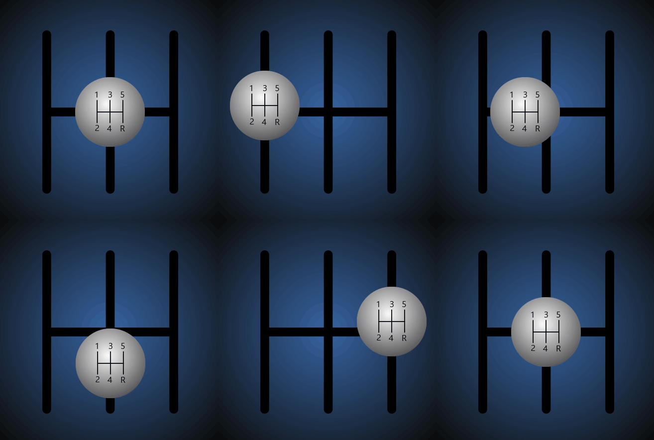
The first one I did is a stick shift from a manual car. I sketched it out, scanned it and brought it into illustrator where I used the line tool to trace over the track and the elipse tool to create the knob. I copied the knob, applied a different gradient to each copy and stacked them with varying opacity to get a bit of a shadow on it, to make it look a little three dimensional and not super plain (even though it still kind of is). Then I brought that into photoshop, created a gradient background and started animating the sequence of shifting through the gears. Pretty simple animation, only tweening position.


stickShifter


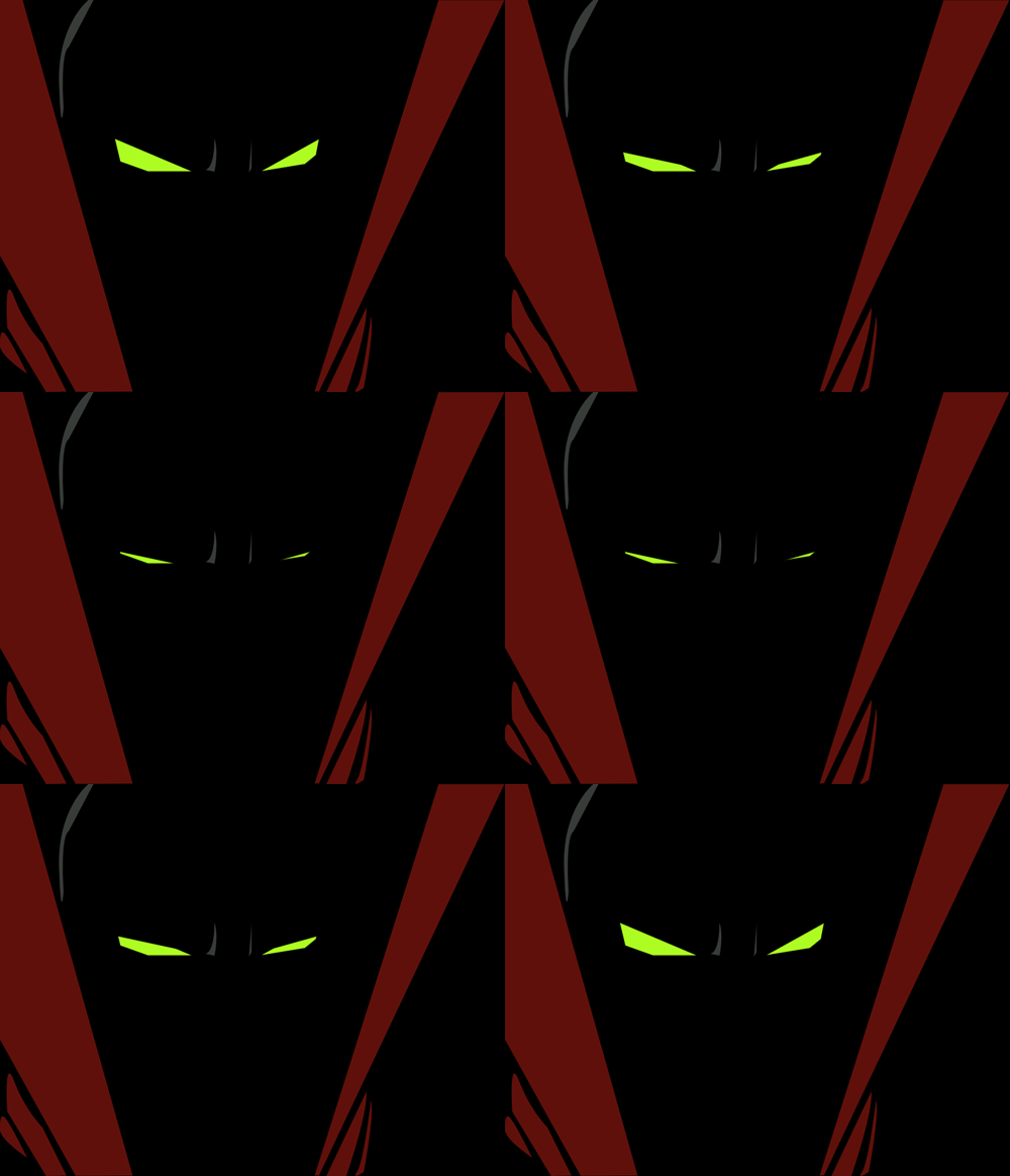
I also wanted to try and replicate a gif I found of the character Spawn that shows a close up of his eye blinking in the dark, classic. Seemed simple enough, I tried to mimic the effect by creating a black box and just tweening its position over his eyes. It kind of worked, it could have been smoothed out a bit better, but I had some difficulty getting the box to emulate an actual eyelid or eye closing. For what it is I think it turned out pretty awesome, and it looks cool. I had sketched his head very roughly this week so I used that as a guide to create his eyes and to place the bigger parts of his cape in using the pen tool. Then I tried my best to create some shapes to represent folds around his neck, not too much though since he’s almost always shrouded in darkness.


spawnEyes


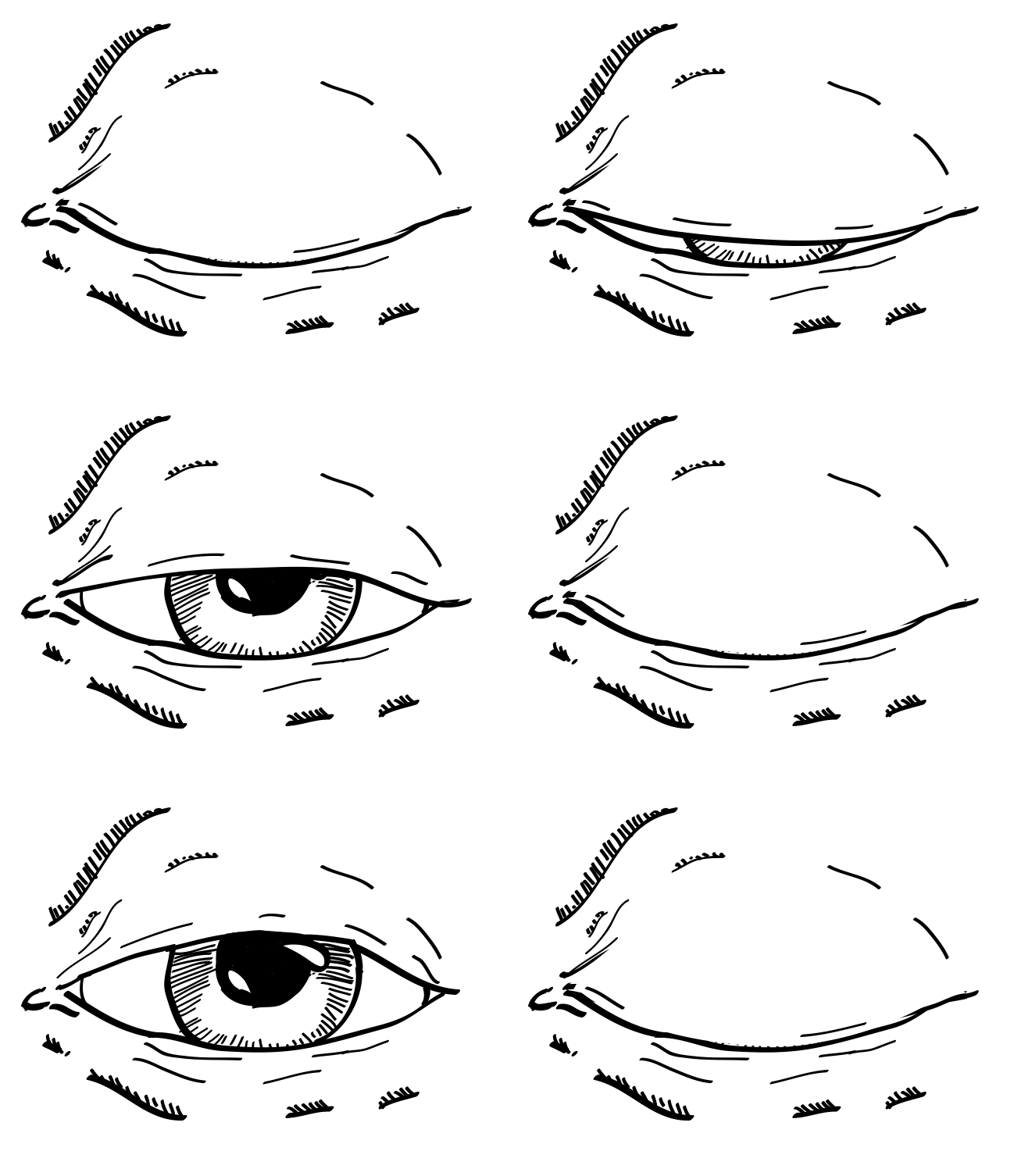
Then since I was frustrated with the result of using tweens to make an eye blink I decided I’d just make individual frames of an eye blinking and sequence them together, so I drew an eye and traced a scan of it using the brush. I ended up making 5 different eyelid variants so that I’d get a good range of motion in the eyelid, brought them all into photoshop and started animating it.  No tweens were used, each frame has a different state of the eye (using stacked layers with toggled visibility) with a timer attached to it and the sequence plays out and repeats. I think this one by far turned out the best, even though I didn’t give myself enough time to add colour to it.


realisticEye


Here’s my concept work / sketches: