
Legal Information & Includes:
I researched board games and tabletop games to find out what I needed to include in my package design. Things that I absolutely needed to include were:
- company information (including full address, website, trademark information)
- where the product was made
- who designed it
- a bar code, price
- box contents
- an indicator if the product contained small parts and was not for children under 3.
- short description of the game
- French translation of any descriptive text present on the package
The more legal information such as the company information and bar code got placed on the bottom, with the box contents and game description on the main/middle section.
Package Layout:
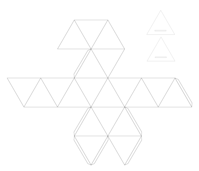
This was probably the most daunting part initially since I couldn’t find a template that would suit my needs and would have to create one myself. It seemed overwhelming at first but once I got started it wasn’t so bad. I created an equilateral triangle with a 6cm measurement per side and started laying them out. Once I had all 20 triangles incorporated I created a small 1cm extension-type flap to use to glue the design together into the desired shape. Looking back I should have made this flap larger so it would have been easier to glue, as it’s being hidden anyways.
I added two rectangular flaps to the ends of two triangles on the top portion which would serve as a means to seal the package. I then created two triangles with slots for these flaps that I would glue onto the inside of the package. This would create a means for it to be opened and resealed.
Colours & Type:
I used a simple legible font called Interstate-Regular for the type on the package, and chose to reuse colours that the Dungeons and Dragons brand uses often (gold and red) but swap how they’re typically used. Instead of going with the standard red for the logo I chose to go with gold and use red for the background instead. I also used gold for headings and the illustrations to help them pop out a bit more. For the general type on the package I initially planned on using gold but after a recommendation from a classmate decided to go with white as it ended up being a little easier to read.
Initially I had the background as a plain flat red but opted to give it an inner glow to give it a pseudo-gradient effect which gave the design a little bit more depth to it. This worked really well, and was practically a night and day change.

Graphics & Production Art:
I chose to create my own artwork for this project. I kept the illustrations plain and simple, creating silhouettes of iconic fantasy items/figures that would be recognizable to everyone. Since the package was intended to be small, keeping the illustrations/artwork simple helped to not overwhelm the design of the package.

Short Project Summary:
My goal with this project was to create something that wasn’t just a simple box. I wanted to create a unique package design that was relevant to the product and that was unique and eye catching. I believe I achieved that goal with my icosahedron (20 sided die) package design.
My design works because it is compact, distinguishable, unique, and iconic. Dungeons and Dragons players will easily be able to distinguish it from a lineup, and without a doubt will have a good idea what it is before they even read the label. Players that are unfamiliar with the product would hopefully be allured by its bright colours and unique shape, causing them to investigate the product (hopefully leading to a purchase).
Over the course of this project I learned how to create a fully functioning package using various flaps, seams, and folds to achieve the result I desired. I got to revisit tracing and illustrating with the pen tool to create the artwork on the package, and I got to practice with typography a bit when it came to fitting the text to unconventional shapes (triangles in this case).
The final package is about as big as a softball, something that can easily be stored on shelves or even on top of each other in a bin/container. Here are some pictures of the final result:


